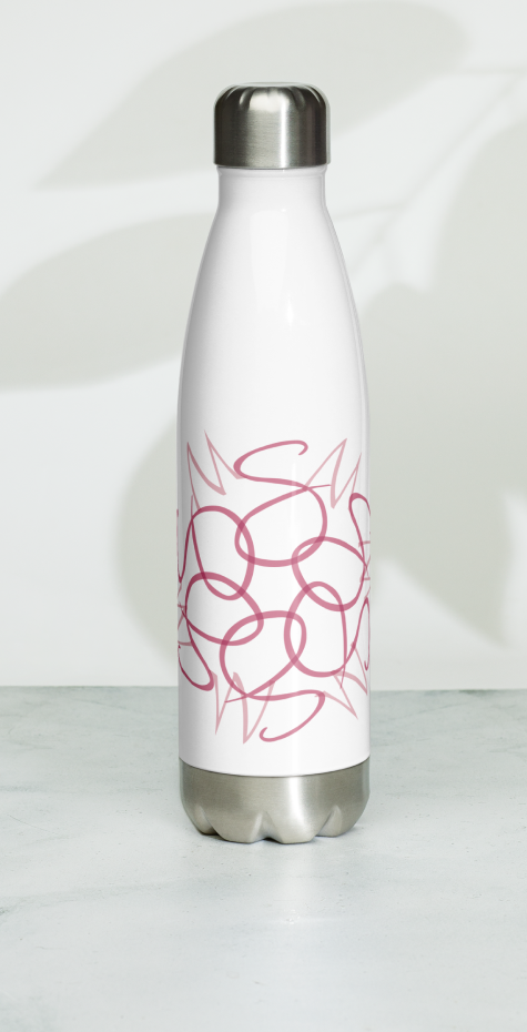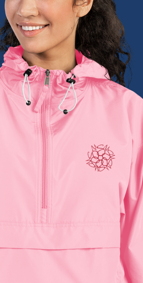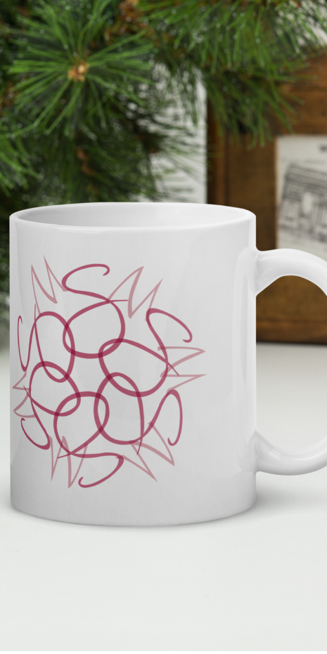


Sieg Marketing provides customized promotional products, also known as ad specialties. They distinguish themselves in a crowded marketplace by developing an in-depth understanding of each customer's business mission and unique marketing needs. This level of attention enables Sieg Marketing to provide highly personalized service and offer creative solutions that often exceed client expectations. In the early days of Sieg Marketing, founder Sharon M. Sieg knew that she wanted her brand to communicate a high degree of personalization, exceptional customer service, and professionalism, as well as the strength and femininity of a woman-owned business. Monograms have long been synonymous with quality and personalization, serving as a personal promise of excellence. Considering that the letters S & M are the initials of the name of the business as well as of its founder, a monogram as brand mark was a natural fit. Intertwining the letters S and M in a circular pattern to suggest a floral form hints at femininity, which is then underscored by the choice of two pinks as the brands signature colors. The choice of dusty, muted pinks over brighter tones suggests maturity. The use of a sans serif font for the wordmark lends strength as well as a modern, classic vibe.
